23 Python: plotnine
-
Python package
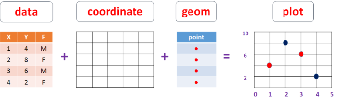
plotnineis the Python equivalent ofggplot2 -
The package is developed with the same philosophy of grammar of graphics
-
Here, we provide some minimal examples of creating plots using plotnine
23.1 plotnine: Overview
Python package
plotnineis an implementation of R packageggplot2The package is based on similar principles; the grammar maps data, aesthetics and objects to create plots
The approach to the plotting are almost identical to R scripts
Install
plotninefromPyPIrepository:pip install plotnine
23.2 Steps of plotnine
Import
plotnine;from plotnine import *Import other relevant libraries:
pandas,numpy,matplotlibStart with
ggplot()Supply a dataset
Include aesthetic mapping with
aes()Add layers as needed
Add on geom objects
geom_point()orgeom_histogram()Add scales like
scale_colour_brewer()Add faceting specifications like
facet_wrap()Add coordinate systems (like
coord_flip()
23.3 Essential part 
| Arguments | Explanation |
|---|---|
| data = | The DATA that you want to plot |
| aes() | AESTHETICS of the geometric and statistical objects, such as color, size, shape and position. |
| geom_ | The GEOMETRIC shapes that will represent the data. |
23.4 Advanced part
| Arguments | Explanation |
|---|---|
| stat_ | STATISTICAL summaries of the data that can be plotted, such as quantiles, fitted curves (loess, linear models, etc.), sums and so o. |
| coord_ | The transformation used for mapping data COORDINATES into the plane of the data rectangle. |
| facet_ | The arrangement of the data into a grid of plots |
| theme_ | The overall visual THEMES of a plot: background, grids, axe, default typeface, sizes, colors, etc. |
| scale_ | MAP between the data and the aesthetic dimensions, such as data range to plot width or factor values to colors. |
23.5 Geometric functions
| Function | Plot | Graphical_parameters |
|---|---|---|
geom_histogram |
Histogram |
colour, fill, alpha
|
geom_freqpoly |
Frequency polygon |
colour, fill, alpha
|
geom_density |
Density plot |
colour, fill, alpha, linetype
|
geom_rug |
Rug plot |
colour, side
|
geom_qq |
Quantile-Quantile plot |
colour, alpha, linetype, size
|
geom_boxplot |
Box plot |
colour, fill, alpha, notch, width
|
geom_violin |
Violin plot |
colour, fill, alpha, linetype, size
|
geom_point |
Scatter plot |
colour, alpha, shape, size
|
geom_jitter |
Jittered points |
colour, alpha, shape, size
|
geom_text |
Text |
colour, alpha, size, label, family, fontface
|
geom_bar |
Bar chart |
colour, fill, alpha
|
geom_line |
Line graph |
colour, alpha, linetype, size
|
geom_hline |
Horizontal line |
colour, alpha, linetype, size
|
geom_vline |
Vertical line |
colour, alpha, linetype, size
|
geom_smooth |
Fitted line |
method, formula, colour, fill, linetype, size
|
23.6 Load Libraries & Read Data
Import plotnine
from plotnine import *
Import other libraries
import pandas as pd
import numpy as np
import matplotlib.pyplot as plt
Set the working directory to the data folder
Read the iris dataset as a Python object DF
DF = pd.read_csv('iris.csv')
23.7 Single variable
23.7.1 Histogram
g = ggplot(data = DF, mapping = aes(x = 'SepalLength')) + geom_histogram()
g
<ggplot: (130071266422)>
C:\Users\s02mn9\ANACON~1\lib\site-packages\plotnine\stats\stat_bin.py:95: PlotnineWarning: 'stat_bin()' using 'bins = 8'. Pick better value with 'binwidth'.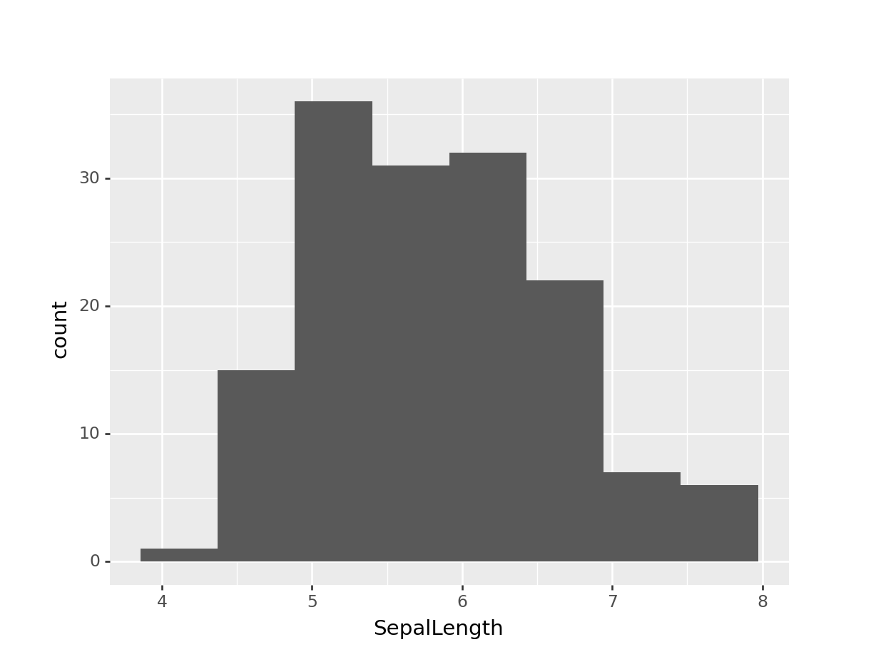
23.7.2 Density plot
g = ggplot(data = DF, mapping = aes(x = 'SepalLength')) + geom_density()
g
<ggplot: (130071295591)>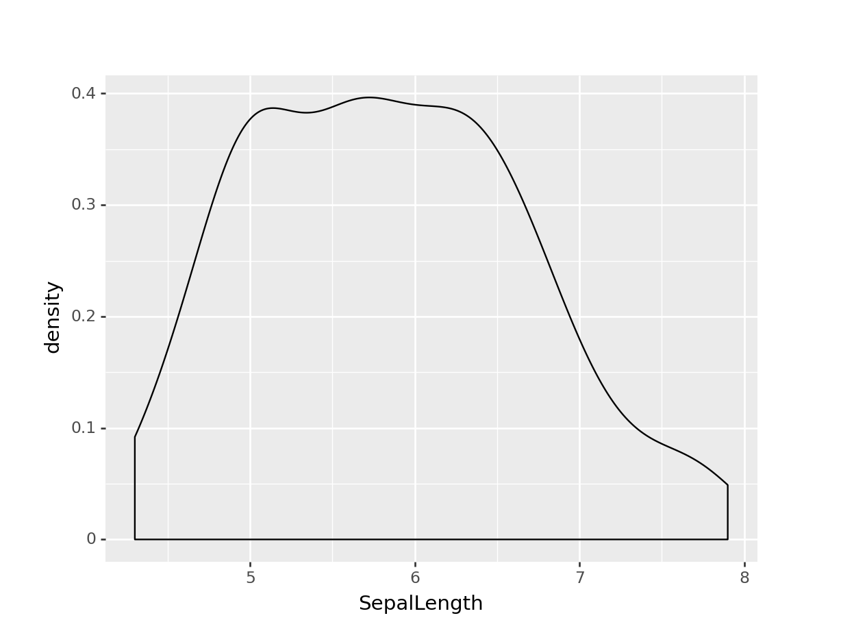
23.7.3 Boxplot
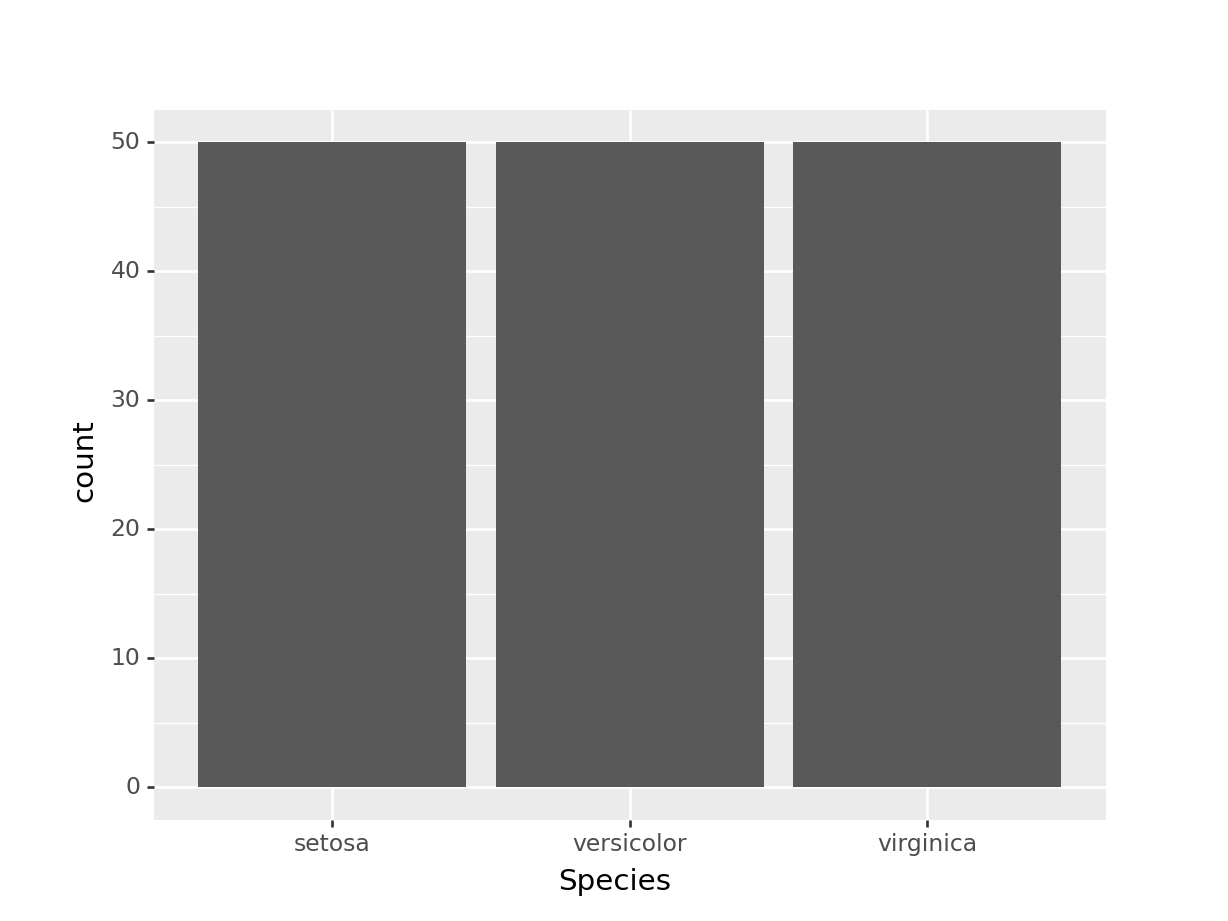
DF[['All Species']] = ''
g = ggplot(data = DF, mapping = aes(x = 'All Species', y = 'SepalLength')) + geom_boxplot()
g
<ggplot: (130071334328)>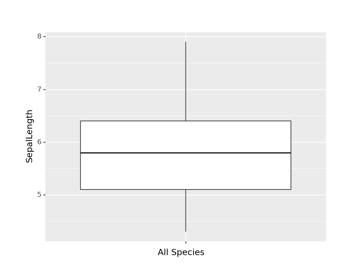
23.8 Multple variables
23.8.1 Scatter plot
g = ggplot(data = DF, mapping = aes(x = 'SepalLength', y = 'PetalLength')) + geom_point()
g
<ggplot: (130071470240)>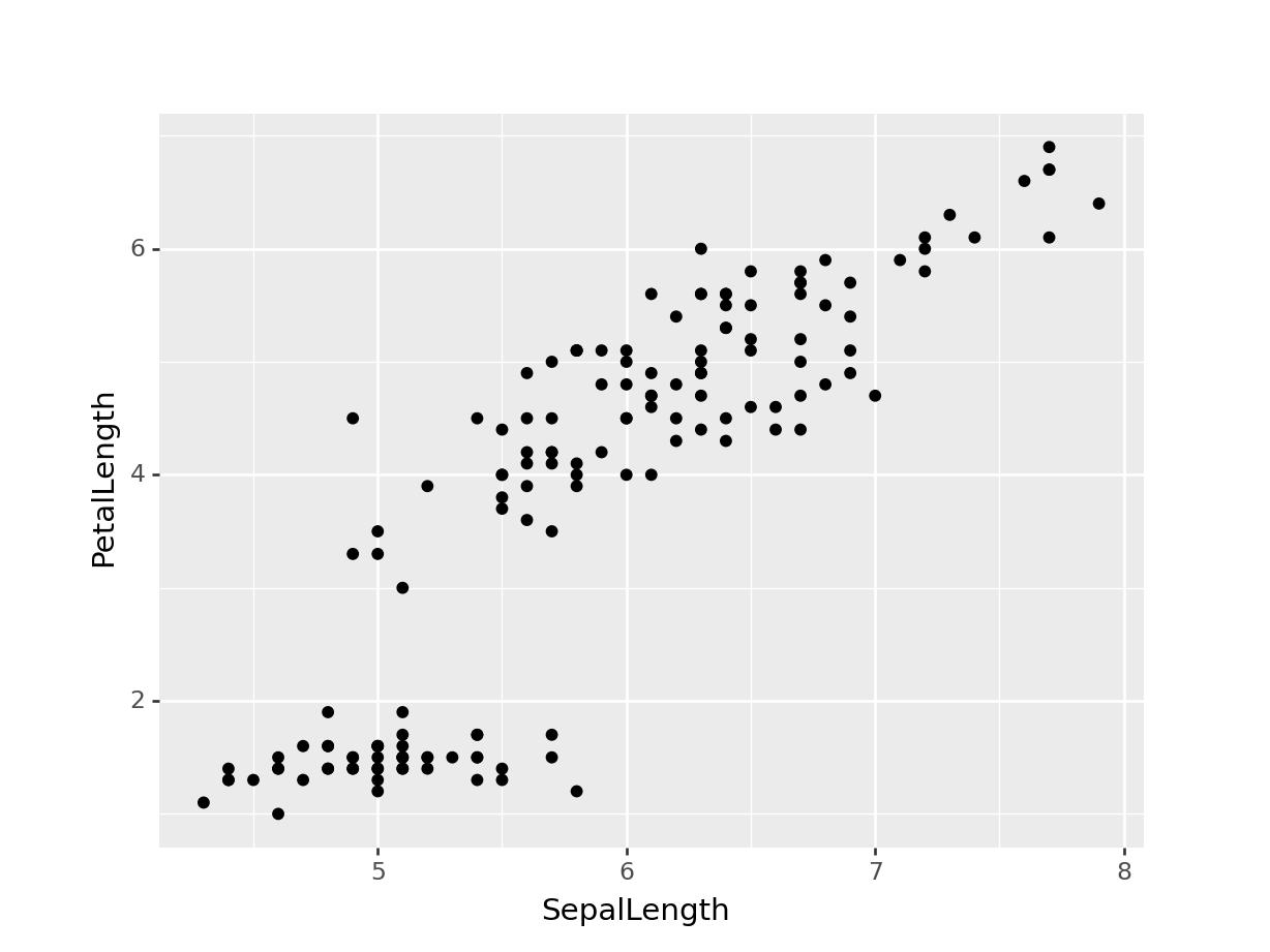
23.8.2 Scatter plot with group
g = ggplot(data = DF, mapping = aes(x = 'SepalLength', y = 'PetalLength', color = 'Species')) + geom_point()
g + theme(subplots_adjust={'right': 0.80})
<ggplot: (130064782138)>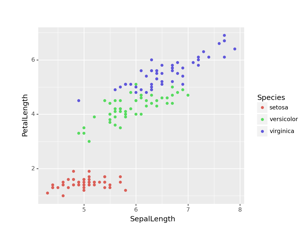
23.8.3 Boxplot
g = ggplot(data = DF, mapping = aes(x = 'Species', y = 'SepalLength')) + geom_boxplot()
g
<ggplot: (130071611094)>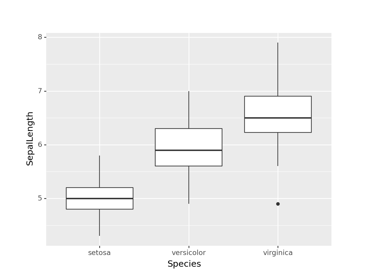
g = ggplot(data = DF, mapping = aes(x = 'Species', y = 'SepalLength', colour = 'Species'))
g = g + geom_boxplot() + facet_wrap(' ~ Species')
g + theme(subplots_adjust={'right': 0.80})
<ggplot: (130064540395)>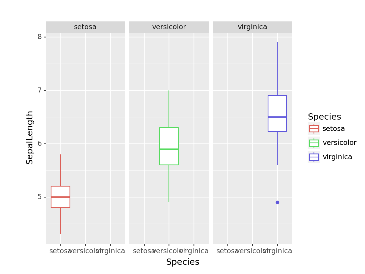
Note:
plotninedoes not includecoord_polargeom; hence pie chart cannot be createdScatter plot matrix using
plotninecan be created with additional customised codes. Extension ofGGallypackage in Python not yet avaialble.The issue of legend clipping in
plotnineplots is discussed here_