Section 23 Two Numerics: Scatter Plot
The generic function geom_point is used for plotting of R objects. For simple scatter plot of two continuous variables, it produces the plot for y against x.
23.1 Scatter Plot
data(mtcars)
# geom_point

g <- ggplot(data=mtcars, mapping=aes(x=wt, y=mpg))
g <- g + geom_point()
g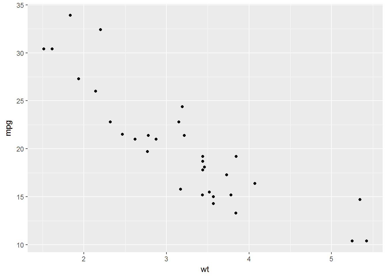
# colour, size

g <- ggplot(data=mtcars, mapping=aes(x=wt, y=mpg))
g <- g + geom_point(colour='blue', size=4)
g
# labs

g <- ggplot(data=mtcars, mapping=aes(x=wt, y=mpg))
g <- g + geom_point(colour='blue', size=4)
g <- g + labs(title='Scatter plot',
              x='Weight (1000 lbs)',
              y='Miles/gallon')
g
# lm, theme_bw

g <- ggplot(data=mtcars, mapping=aes(x=wt, y=mpg))
g <- g + geom_point(colour='blue', size=4)
g <- g + geom_smooth(method=lm)
g <- g + labs(title='Scatter plot',
              x='Weight (1000 lbs)',
              y='Miles/gallon')
g + theme_bw()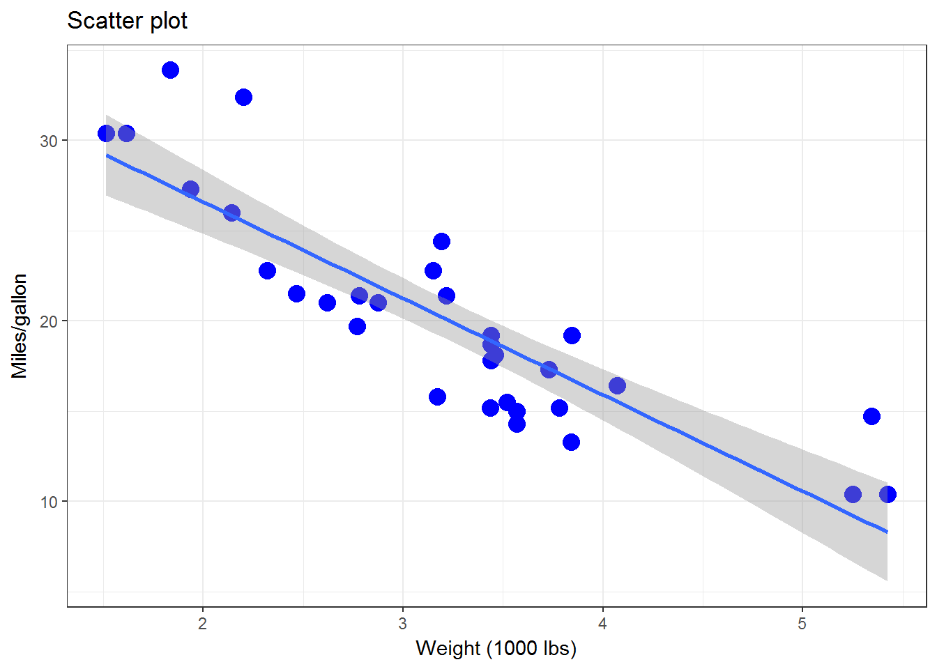
# se=FALSE

g <- ggplot(data=mtcars, mapping=aes(x=wt, y=mpg))
g <- g + geom_point(colour='blue', size=4)
g <- g + geom_smooth(method=lm, se=FALSE, colour='red')
g <- g + labs(title='Scatter plot',
              x='Weight (1000 lbs)',
              y='Miles/gallon')
g + theme_bw()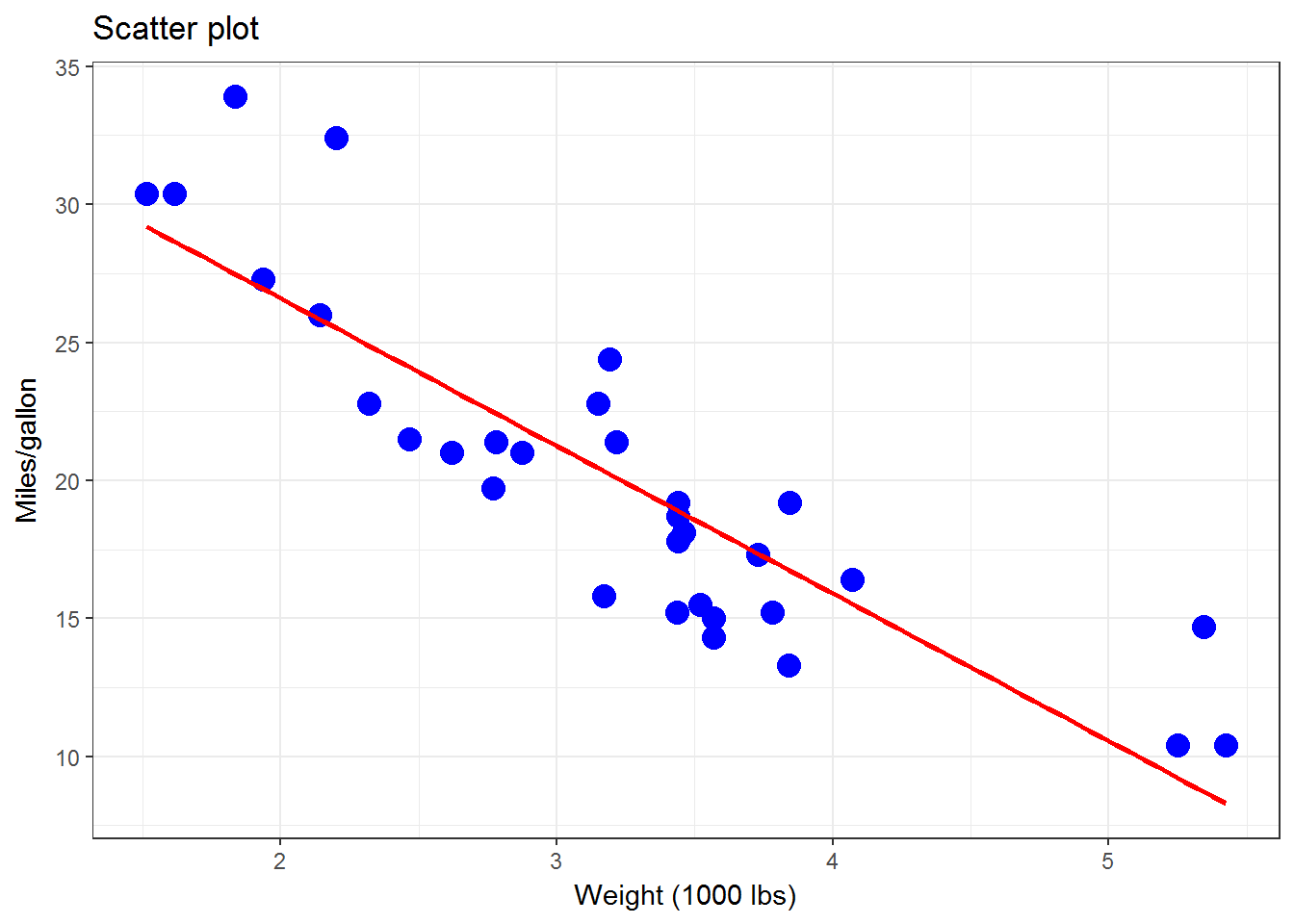
# loess

g <- ggplot(data=mtcars, mapping=aes(x=wt, y=mpg))
g <- g + geom_point(colour='blue', size=4)
g <- g + geom_smooth(method=loess, se=FALSE, colour='red')
g <- g + labs(title='Scatter plot',
              x='Weight (1000 lbs)',
              y='Miles/gallon')
g + theme_bw()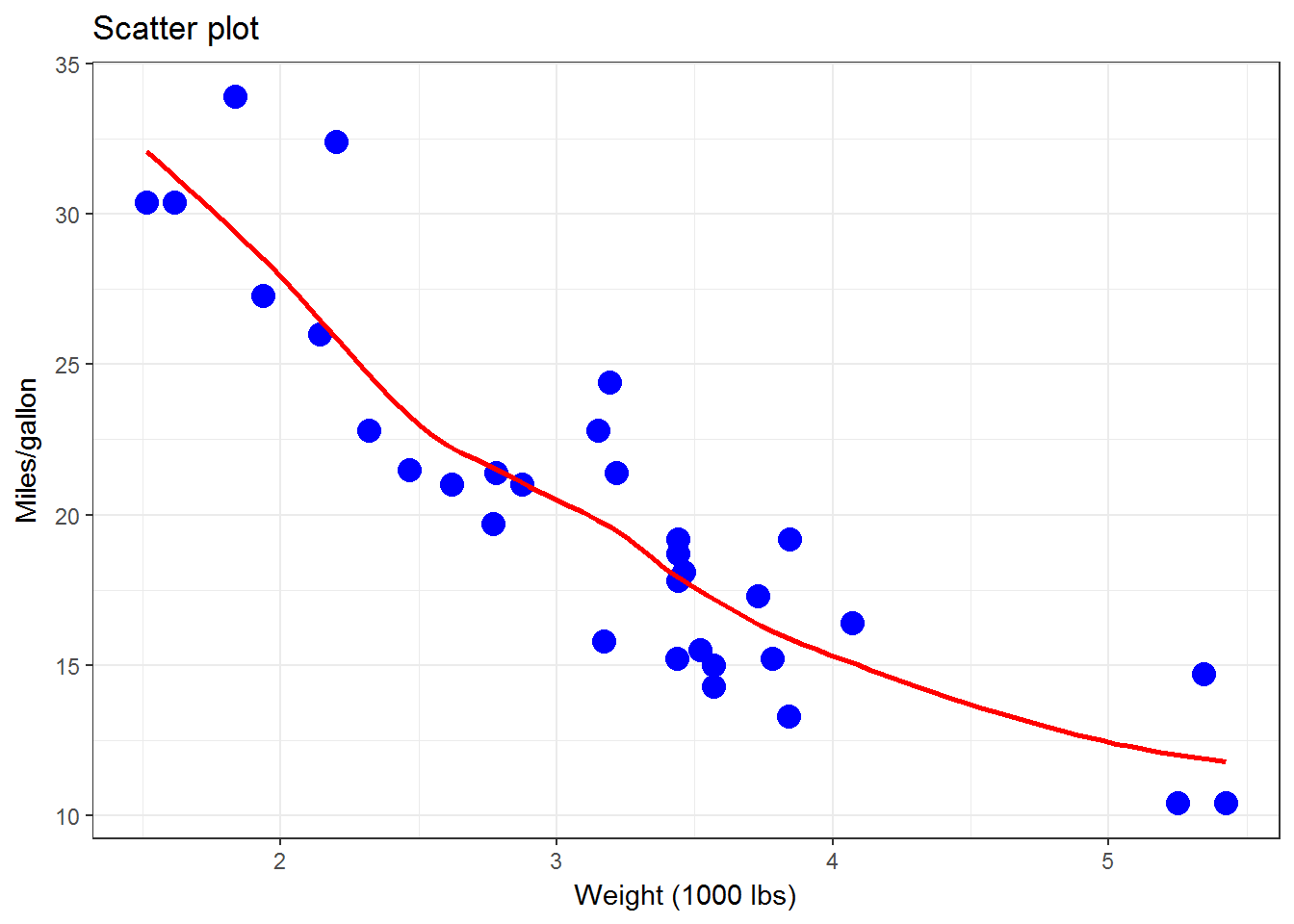
23.2 Scatter & Rug Plot
data(mtcars)
g <- ggplot(data=mtcars, mapping=aes(x=wt, y=mpg))
g <- g + geom_point(colour='blue', size=4)
g <- g + geom_smooth(method=loess, se=FALSE, colour='red')
g <- g + geom_rug(alpha=0.50, position='jitter', colour='purple')
g <- g + labs(title='Scatter plot',
              x='Weight (1000 lbs)',
              y='Miles/gallon')
g + theme_bw()
- Exercise: Prepare a scatter and rug plot from
mpgdata withctyagainstdispl
data(mpg)
23.3 Scatter and Line Plot
Deterministic relationship between x and y
x <- c(1:20)
y <- 5*x^2
DF <- data.frame(x=x, y=y)

g <- ggplot(data=DF, mapping=aes(x=x, y=y))
g <- g + geom_point(colour='blue', size=4)
g
g <- ggplot(data=DF, mapping=aes(x=x, y=y))
g <- g + geom_line(colour='blue', size=1)
g
g <- ggplot(data=DF, mapping=aes(x=x, y=y))
g <- g + geom_point(colour='blue', size=4)
g <- g + geom_line(colour='blue', size=1)
g + theme_bw()
23.4 Explore the relationship
Explore the relationship between x and y from the sampled data shown in the code below.
set.seed(1234)

x <- rnorm(n = 20, mean=10, sd=2)
y <- 2*x + rnorm(n = 20, mean=0, sd=1)
DF <- data.frame(X=x, Y=y, C=LETTERS[1:20])
summary(DF)
Produce a scatter plot of y against x
Change the colour, shape and size of the points
Draw lines through the average of y and x
Draw a linear regression line and a smooth loess line that fit the data