Section 18 Single Continuous Variable: Histogram
18.1 Histogram
- Karl Pearson introduced this visual representation
- Continuous variable
- Probability distribution
- Class width / interval / boundary: equal or unequal
- Bins / Intervals / Breaks
- Frequency, Frequency Density
- Comparison with Normal density function
- Ideal Normally distributed data:
- Symmetry
- Unimodal
- Identical Mean, Median, Mode
- No Skewness
- No kurtosis
18.2 package base
data(iris)

hist(x=iris$Sepal.Length, breaks=15,
     xlim=c(4,8), freq=FALSE,
     main='Histogram of Sepal Length',
     xlab='Sepal Length (cm)',
     ylab='Density',
     axes=TRUE,
     col='orange',
     lty=1, border='purple')
abline(v=mean(iris$Sepal.Length), lty=2, lwd=3, col='red')
abline(v=median(iris$Sepal.Length), lty=2, lwd=3, col='blue')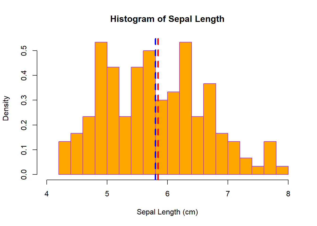
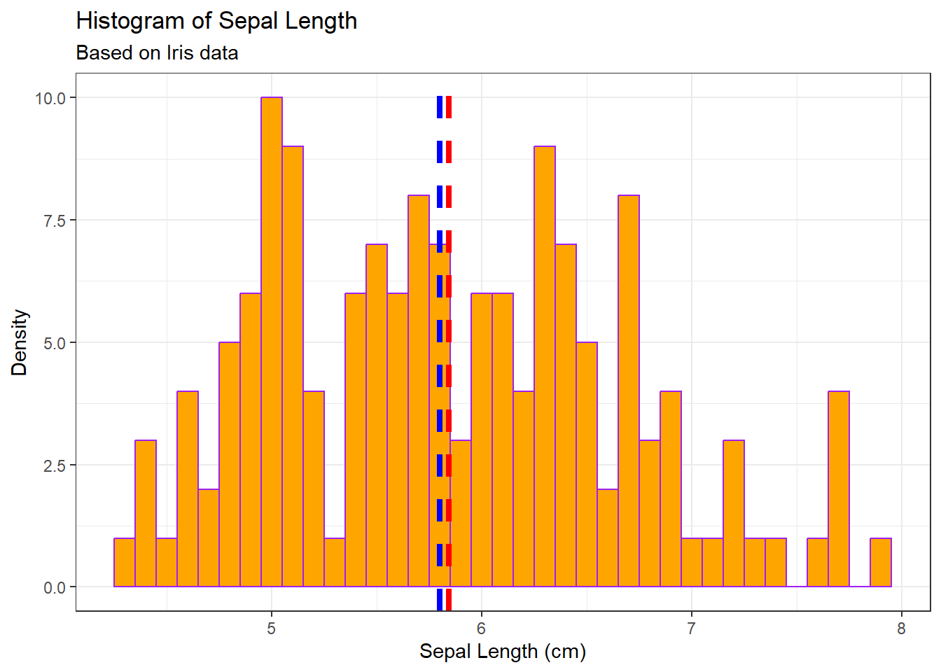
18.3 package ggplot2
library(ggplot2)

g <- ggplot(data=iris, mapping=aes(Sepal.Length))
g <- g + geom_histogram(binwidth=0.10, fill='orange', colour='purple')
g <- g + geom_vline(aes(xintercept=mean(Sepal.Length, na.rm=TRUE)),
                    colour='red', linetype='dashed', size=1.5)
g <- g + geom_vline(aes(xintercept=median(Sepal.Length, na.rm=TRUE)),
                    colour='blue', linetype='dashed', size=1.5)
g <- g + labs(title='Histogram of Sepal Length',
              subtitle='Based on Iris data',
              x='Sepal Length (cm)',
              y='Density')

g + theme_bw()